In our previous article, we discussed the Heikin Ashi chart pattern. Today we will introduce you to Kagi Chart Trading Strategy. Like Heikin Ashi and Candlestick pattern, it was also developed in Japan. There is a slight difference between the traditional chart pattern and the Kagi chart pattern. Unlike traditional charts like the candlestick, bar, and line, this chart only deals with price, time is not considered here.
Structure of the Kagi Chart
First of all, let’s start with the structure of KC (Kagi Chart). It looks like a series of vertical lines. If you are dealing with an excessive noise problem, KC is the solution here. Like the Renko, it also eliminates excess noise by not reacting to smaller price movements. Hence, the chart lessens the ambiguity in making the trading analysis.
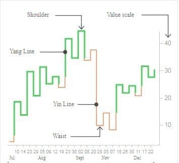
Kagi Chart Trading Strategy
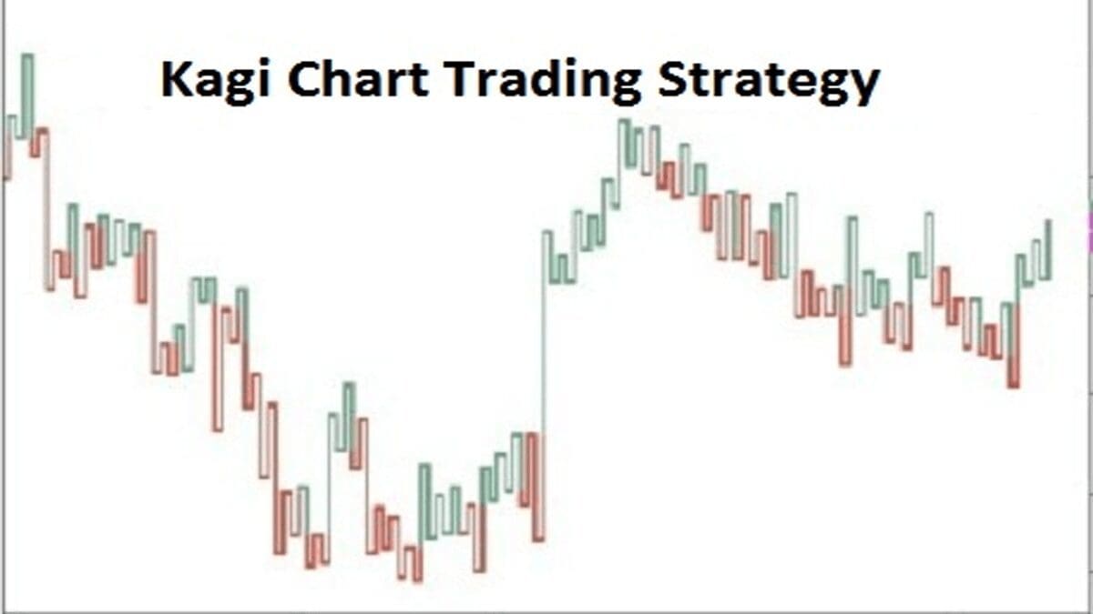
The above image is given to clarify the concept of the Kagi chart structure. The varying thickness or color of the line is fully dependent on the price action and market behavior.




- The thick or green Kagi line is called a Yang line while the thin or red line refers to the Yin line.
- When the price moves to a bullish trend the line becomes green or thick but during a bearish trend, the red or thin line appears.
- A yin to yang shift indicates to buy while yang to yin indicates a sell signal.
- The line keeps extending as long as the price moves in the same direction and when the reversal happens the line makes a u-turn and goes in the opposite direction.
- In the thick or green line, the connecting plugging line refers to as the “shoulder” and in the red or thin line the connecting plugging line is called the “waist”. The reversal trend starts always with a breakout of either the shoulder or waist.
Avoid False Signals by Applying Indicators
Though the chart pattern is quite famous for giving good signals during trading, sometimes it also provides a false signal. Hence, in order to avoid such kind of false signals, many investors apply indicators. Among the indicators, RSI and MACD indicator is quite well-known. If the RSI line is above 50, it provides a buy signal while below 50 gives the sell signal. Now, come to the MACD indicator, in MACD there are two lines, a MACD line, and a signal line. When the MACD is above the signal line that indicates the buy and the signal line above MACD indicates the sell signal. By using the two indicators with KC one can easily avoid the false signal.
General Characteristics of the Kagi Chart Trading
- You can set the reversal amount according to your wish. If you are an intraday trader it is advisable to set the reversal percentage at 1 and if you are a long-term investor, set the percentage at 4.
- Greenline or thick line means the bullish trend has appeared while the red or thin line means a bearish trend.
- It will provide proper price and market activity without creating noise.
- By applying indicators Kagi works perfectly to show the current and future price fluctuation, buyers-sellers relation, and the strength of the market speed.
Real-Life Example of a Kagi Chart Trading
Let’s move to an example. I am giving Reliance Industries’ share price weekly Kagi chart with RSI and MACD. As I’ve stated that RSI should be above 50, the RSI is 60 plus here. After that, come to MACD. Keep an eye on buying and selling lines of MACD. In this way, you can avoid false signals very easily.
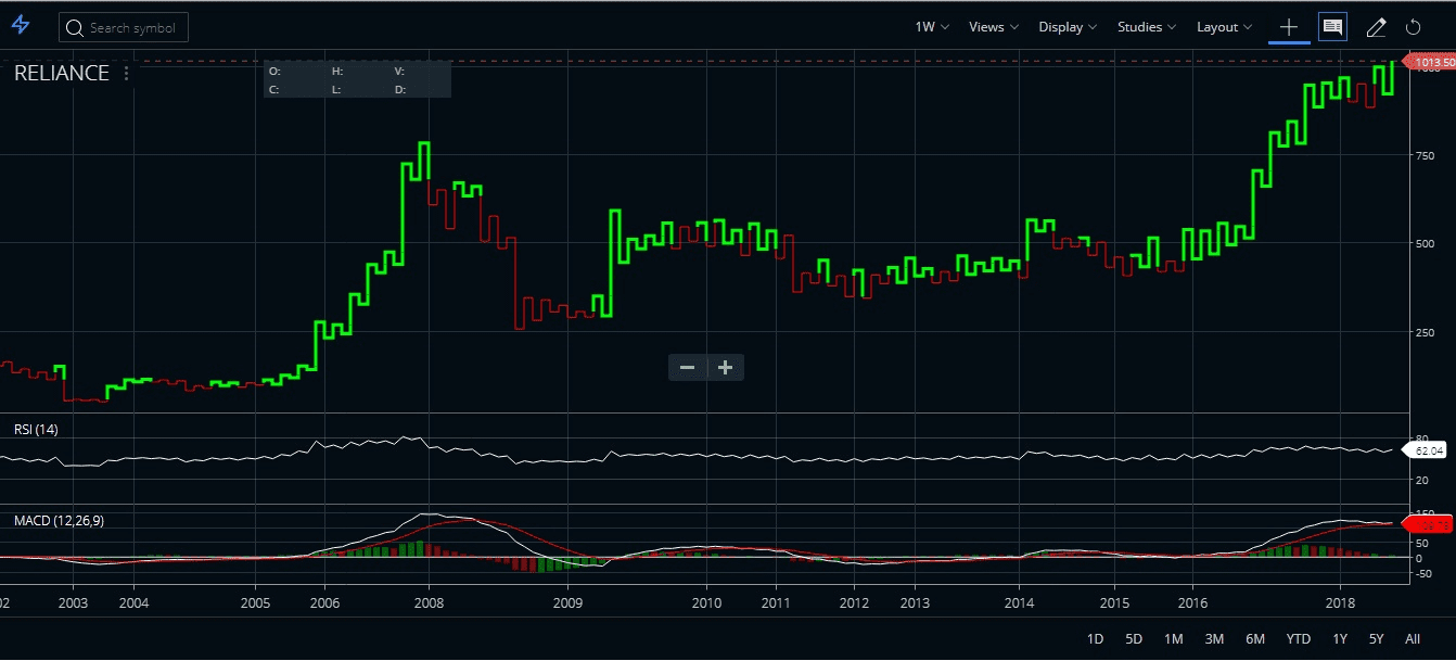
Identifying the Market Condition
You can see in the above chart can also decide between bull or bear market zones. Here the Redline shows a bearish trend, and the green shows a bullish trend. Let’s see what the indicators say. According to RSI, it is above 50 which means it is a buy signal while the MACD line is slightly above the signal line, indicating a buy signal too there. Therefore, there is coordination which provides a message that the time is right to buy shares of the company.
Differences between the Kagi Chart & the Candlestick Chart
There are key differences between the Kagi and the normal Candlestick pattern. Some of the main differentiating factors are given below.

- A candlestick chart stands for both time and price. Every single candlestick represents one session. One session could be represented as low as a 1-minute or even 1-week
- A Kagi chart stands only for the price. It does not consider the time.
- There are no particular settings involved with a candlestick chart. But in a Kagi chart, the reversal price is a vital setting to make.
- A Kagi chart shows only the price movement. On the other side, a Candlestick chart shows how prices moved within a specific session. A candlestick chart indicates the high and low prices as well, which is missing from the Kagi chart pattern. Only closing prices are shown on this Kagi chart.
- The Kagi chart plots the vertical lines which are connected by horizontal lines. Whenever the price breaks a previous high, a bullish Kagi line is drawn there, while breaking down below the previous low results in a bearish Kagi line that is drawn here.
- A Kagi chart can be applied to any type of market, similar to a candlestick chart.
- The similarity is both the Kagi and the Candlestick charts originated in Japan.
FAQ
Kagi trading involves setting a buy or sell order when the chart line reverses its direction. For example, prices fall and then break to the upside triggering a buy signal. The opposite is true for selling. It’s important to use stop losses wisely when trading Kagi charts in order to protect capital against sudden price swings.
A Kagi chart plots closing prices on a graph together with vertical lines that reflect changing trends within an asset’s market movement by trend reversal points specified by user-defined parameters such as percentage change of close or open interest. This allows traders to identify areas where support or resistance may be applicable and react accordingly when there are significant shifts in the underlying asset’s behavior likely caused by investor sentiment changes towards it.
Kagi Chart is essentially a Japanese Line Chart designed primarily for stocks & futures markets allowing investors & analysts efficient graphical overviews distinctively characterized through horizontal “Kagies” connecting respective values plotted along X axis whereby stunningly intuitive trend spotting turns possible regardless of range differences suggesting possibilities over momentary & sustained ranges successfully providing better outlook opportunities exactly same like moving averages do right now globally across multiple exchanges worldwide!
Conclusion
So, Kagi Chart Trading Strategy is quite an important add-on in the Indian charting platforms. It provides a noise-free clear signal that helps to read the price movements. Kagi Chart Trading Strategy is nothing but an important chart pattern in technical analysis.