
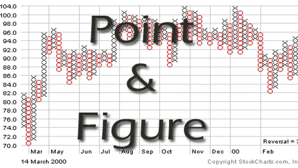
A point and figure chart (P&F) is a charting technique used in technical analysis. It is mainly used to attempt to predict financial market prices. The P&F chart is unique in that it does not plot price against time as all other techniques do. Instead, it plots the price against changes in direction by plotting a column of X’s as the price rises and a column of Os as the price falls.
An anonymous writer named “Hoyle” first gave the reference to the Point and Figure chart. He wrote a book The Game In Wall Street, And How To Play It Successfully way back in 1898. That was the first time someone took reference to this technique of charting.
Moreover, you may have seen auto-updating Nifty’s P&F charts on our P&F Charts page.
FAQ
P&F charts are drawn using Xs and Os. The X denotes that the price is rising and the Os denotes that the price is falling. Price is scaled on the vertical Y-axis. No time scale is there along the horizontal X-axis. Time is not a part of construction or analysis. Traders ignore any price changes below the box size. Column changes are determined by Reversal Size.
P&F charts are typically (not always) constructed with Xs and Os. Xs represent up movements. Similarly, Os represent down movements.
P&F charts are useful as it shows the correct voice of the market. It only moves when the market moves. Therefore this charting technique creates unambiguous signals. It also provides an objective trend definition and multiple time frames from the same data. Moreover, P&F charts provide objective price targets & risk-reward ratios. This charting technique is better for relative strength analysis.
The main difference between Point & Figure Chart (P&F) vs Renko lies in how they display data points; P&F displays data with up/down movement segments while Renkos use individual bricks with no regard to time or direction-related movement patterns.
How to Attach a Point and Figure Chart to a Stock or Index?
P&F Chart on Zerodha Kite
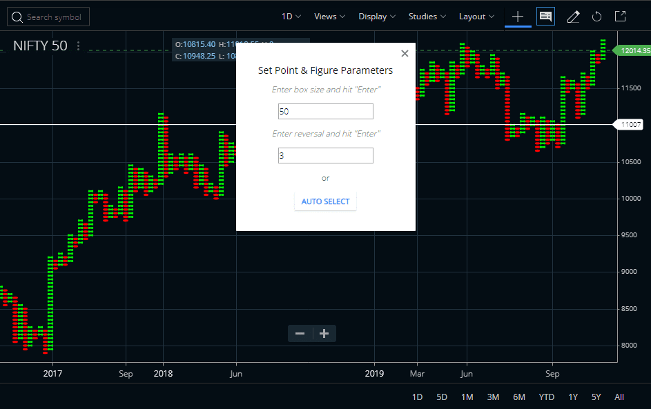
Nowadays P&F is an option in all major charting and trading platforms. It is also available in Zerodha Kite. To see P&F charts in Zerodha Kite click on Display and select Point & Figure option. By clicking on the settings icon you can also set Point and Figure chart parameters.
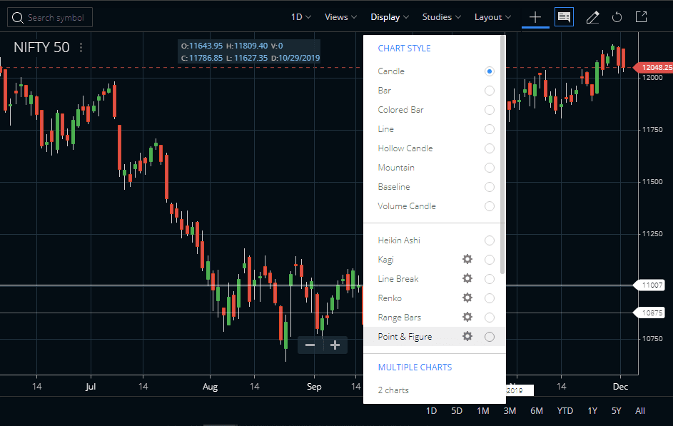
You can keep the default parameters or you can change the box size and reversal. Once you implement the changes, hit enter and the changes will be seen on the chart.
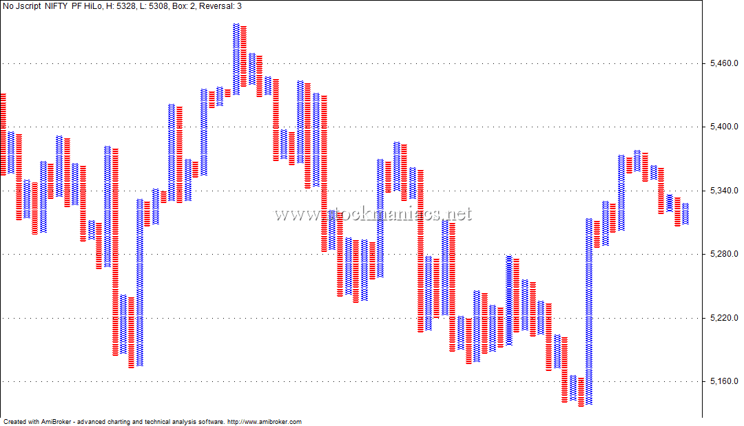
P&F Chart on AmiBroker
Similar to Zerodha Kite, Point and Figure chart is also available in other trading platforms like AmiBroker or MT4, etc. Check the image below to know what this charting pattern looks like on the AmiBroker platform.
Download Point and Figure AmiBroker AFL Code
Copy and paste the AmiBroker formula from below.






How to trade the Point and Figure chart?
Now let us discuss different ways to trade the P&F chart.
Identify Support and Resistance with a Point and Figure chart
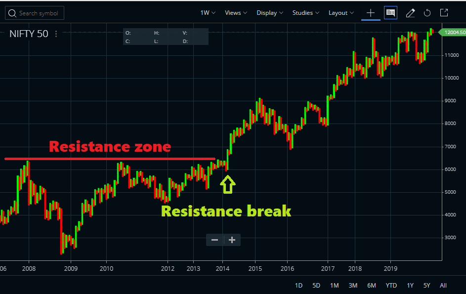
The P&F chart is typically useful to identify major supports and resistances. As this chart is free from time, it can hold a long period of data in a short space. So we can easily identify long-term support and resistance breaks easily from this type of chart.
Drawing trendline on the P&F chart
Drawing a trendline on the Point and Figure chart is a very popular method of analyzing. It gives an immediate idea of the breakout or breakdown on the chart. Generally, a trendline break in the P&F chart is typically followed by a big move. This is because this type of chart is free from regular noise.
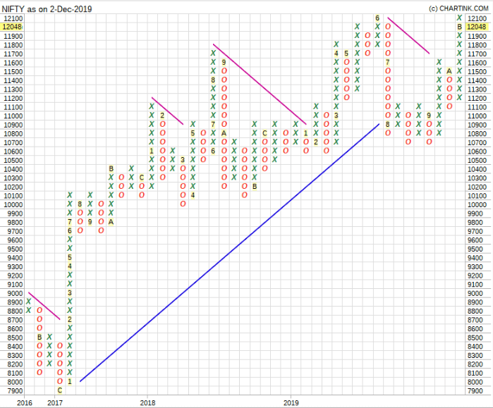
Generally, the break of the trendline at the 45-degree angle is typically helpful. It denotes the start of a fresh one-sided move. We can also identify a potential target from the magnitude of the previous consolidation range.
Identifying Long-Term Breakout Points
The P&F Chart can contain large data into a small space. The chart is much more noise-free. Check the image below where you will find the Reliance share price chart from 1995 to date contained in a small chart.
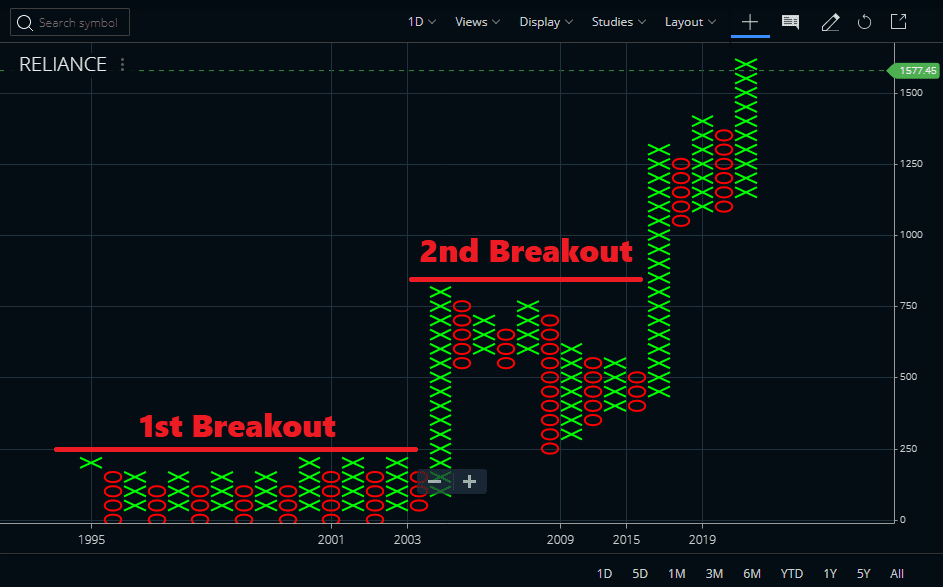
In the image above we can see that Reliance was going through a prolonged consolidation phase from 1995 to 2003. The breakpoint was at 225. When the price crossed it, the stock directly rallied to 825 zones in the next few years. It made a peak in 2008. There was no sign of a pause in the daily P&F chart. Then the stock saw a correction and consolidated for the next 9 years. Then again we have seen a breakout in 2017 and currently, the stock is trading at the 1580 level. There is very little noise in the P&F chart.
Using indicators with P&F Chart
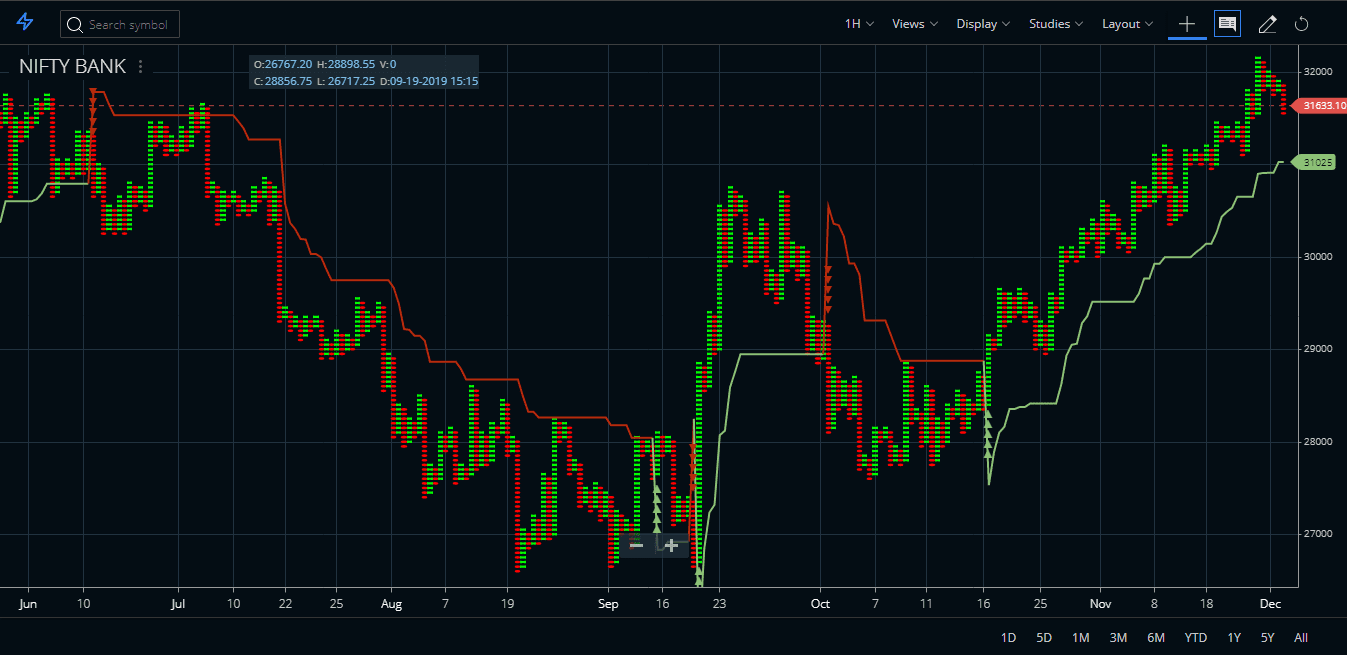
We can also use indicators with Point and Figure charts. I have tested using the SuperTrend indicator with Bank Nifty hourly P&F chart. For instance, I have seen that Bank Nifty being a volatile counter gives big moves in the winning signals. Few signals even produced 2000-4000 points profits in single signals. Even in the hourly charts, trades can last from a few weeks to a few months.
Suggested Reading
I suggest you read the following book on this subject. The Definitive Guide to Point and Figure: A Comprehensive Guide to the Theory and Practical Use of the Point and Figure Charting Method. CMT Jeremy Du Plessis has written this book.

Point and Figure Chart PDF
We are also sharing here an in-depth PowerPoint presentation prepared by the same Jeremy Du Plessis. You can freely download this PowerPoint presentation by clicking the download link here.
This PowerPoint presentation will give you an introduction to how point and figure chart work. You may distribute this PowerPoint presentation to your friends, but do not forget to refer them to our site.
Conclusion
In conclusion, the P&F chart is a very old method of charting. It has been invented even before the year 1900. This method of charting has very little noise on the charts. Nowadays this type of chart is available in popular trading and charting platforms. Many professional traders use this chart.