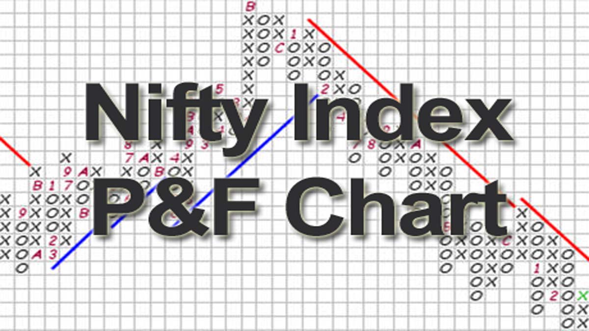
The Nifty P&F chart below lets you analyse the Nifty 50 point and figure chart using adjustable box size, reversal settings, and historical timeframes. This NSE point and figure chart helps traders quickly identify trend direction, breakouts, and key support or resistance levels by filtering out market noise and focusing only on significant price movements in the Nifty index.
Nifty P&F Analysis
What Is the Nifty P&F Chart?
The Nifty P&F chart (Nifty Point and Figure chart) is a powerful technical analysis method used by traders to identify clear price trends in the Nifty 50 index. Unlike traditional candlestick charts, the point and figure chart focuses only on price movements, filtering out minor market noise.
A Nifty 50 point and figure chart plots rising prices with X columns and falling prices with O columns. This approach helps traders easily identify breakouts, reversals, and long-term trend direction in the NSE point and figure chart.
Because time is removed from the chart, traders can concentrate purely on supply and demand dynamics within the Nifty index.
How to Use the Nifty Point and Figure Chart
The Nifty P&F chart tool above allows traders to analyse price movement using customizable parameters.
Key inputs include:
Box Size
The box size determines the minimum price movement required to plot a new box on the chart. Larger box sizes filter more noise and highlight long-term trends.
Reversal Size
The reversal value determines how many boxes the price must move in the opposite direction to start a new column.
Timeframe Selection
You can analyze the Nifty 50 point and figure chart across multiple historical periods, such as:
- Last 1 year
- Last 3 years
- Last 5 years
- Full historical data (Max)
This flexibility helps traders perform both short-term and long-term trend analysis.
Why Traders Use the Nifty 50 Point and Figure Chart
Professional traders and investors often rely on the NSE point and figure chart because it provides a clear view of market structure.
Key benefits include:
Noise Reduction
Traditional charts contain a lot of intraday fluctuations. The Nifty P&F chart removes insignificant price changes, allowing traders to focus on meaningful moves.
Clear Trend Identification
Columns of Xs and Os clearly highlight bullish and bearish trends.
Reliable Breakout Signals
Point and figure charts are widely used to identify classic breakout patterns such as:
- Double Top Breakout
- Triple Top Breakout
- Double Bottom Breakdown
- Bearish Catapult Patterns
Objective Support and Resistance Levels
The structure of the Nifty point and figure chart makes it easier to identify key price levels.


Understanding Signals in the NSE Point and Figure Chart
When reading a Nifty P&F chart, traders usually focus on the following signals.
Bullish Breakout
A bullish breakout occurs when a column of X exceeds the previous column high. This often indicates increasing demand for Nifty.
Bearish Breakdown
A bearish breakdown occurs when a column of O falls below the previous column low, signaling increasing selling pressure.
Trendlines
Point and figure charts also use 45-degree trendlines to identify bullish support and bearish resistance.
These trendlines help traders determine the broader direction of the Nifty 50 index.
Who Should Use the Nifty P&F Chart?
The Nifty point and figure chart is useful for multiple types of market participants:
Swing Traders
Identify breakout setups and trend reversals.
Positional Traders
Analyze medium-term trends in the Nifty 50.
Long-Term Investors
Understand structural market direction using the NSE point and figure chart.
Because the chart removes time-based noise, it is especially useful for trend-following strategies.
Final Thoughts on the Nifty P&F Chart
The Nifty P&F chart is one of the most effective tools for identifying clear market trends in the Nifty 50 index. By focusing only on price movements, the Nifty 50 point and figure chart provides a simplified view of market behaviour.
Using the NSE point and figure chart tool above, traders can quickly evaluate trend direction, breakout opportunities, and potential reversal levels in the Nifty index.
Whether you are a beginner or an experienced trader, the Nifty point and figure chart can become an essential part of your technical analysis toolkit.
Next, Check Out Other Market Charts
- Click Here to track live Gift Nifty movement and global market sentiment before the Indian market opening.
- Click Here to analyse end-of-day technical trends and price action of Nifty 50 stocks.
- Click Here to monitor EOD movement and technical strength of Nifty Next 50 companies.
- Click Here to follow end-of-day trends and momentum in leading midcap stocks.
- Click Here to evaluate market valuation using the historical PE ratio indicator.
- Click Here to measure market breadth and sentiment using the TRIN indicator.
- Click Here to track real-time market breadth using advancing versus declining stocks.